Loading…
← Back to work
ConceptWellness · Website
Form Studio
A boutique pilates and movement studio in London. Designed to convert curious visitors into committed members, without feeling like a gym website.
Make it feel premium and calm, communicate the small-group ethos clearly, and make it easy to understand the class timetable and pricing without having to call anyone.
Form Studio is a boutique reformer and mat pilates studio operating in a competitive London market. Their clients are urban professionals who are health-conscious, aesthetically minded, and used to quality.
The website needed to reflect that. That was the brief in full — premium, calm, and clear, so a first-time visitor never has to pick up the phone just to understand the offering.
What was built
01
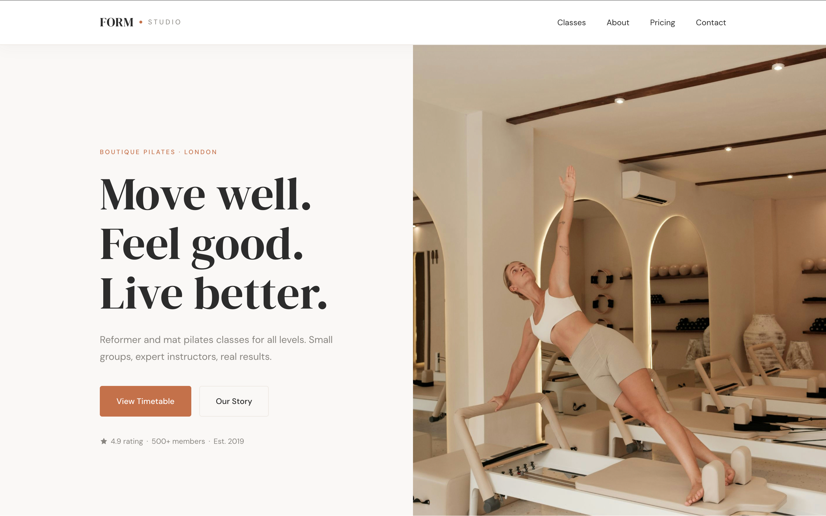
Split hero layout
Left column carries the headline and CTAs; right column shows a full-height studio image. On mobile it stacks cleanly. The split signals editorial quality immediately. This is not a template.
02
Class timetable section
A simple weekly grid showing class types, times, and days. No third-party embed, just clean HTML that loads instantly. Clients can see availability at a glance without clicking away.
03
Three-tier pricing cards
Drop-in, monthly, and founding member pricing clearly laid out with a highlighted "most popular" card. Removes the need for clients to ask about cost, so they can make a decision before they enquire.
04
Instructor profiles
Round portrait images with certifications and specialisms. People book people, not studios. Making the instructors visible builds trust and reduces drop-off.
05
First class free CTA
The lowest-friction possible entry point. A specific offer with a specific button reduces the mental barrier to booking for first-time visitors.
Design direction
Warm, earthy, movement-focused. The palette uses terracotta, sage, and warm white. It feels like somewhere you'd actually want to spend an hour. Clean enough to feel premium, warm enough to feel welcoming.
Typography: DM Serif Display for headlines (gives it editorial weight), DM Sans for body (modern, legible, friendly). The combination reads as boutique without trying too hard.
Terracotta
#c4714a
Sage
#8a9e7a
Warm white
#faf8f5
Near-black
#2c2c2c
Concept build by
Sophia, Glow Digital
This is a concept project demonstrating what I'd build for a wellness studio client. Want something like this for your business?
Want something like this?
Tell me about your business and I'll show you exactly what I'd build for you.
Start your brief →